
Why Some Art works (and Others Don't): How to Train Your Eye
You've felt it before.
You walk past a painting and something stops you. You don't know why. You just know it works.
And you've felt the opposite too — a piece that's busy, colourful, even technically complex, and yet it holds your attention for about three seconds before your eyes move on.
So what's the difference?
It's not magic. It's not mystery. And you don't need an art degree to see it.
Here's a straightforward way to understand what your eye is already picking up on.
Two Versions of the Same Scene
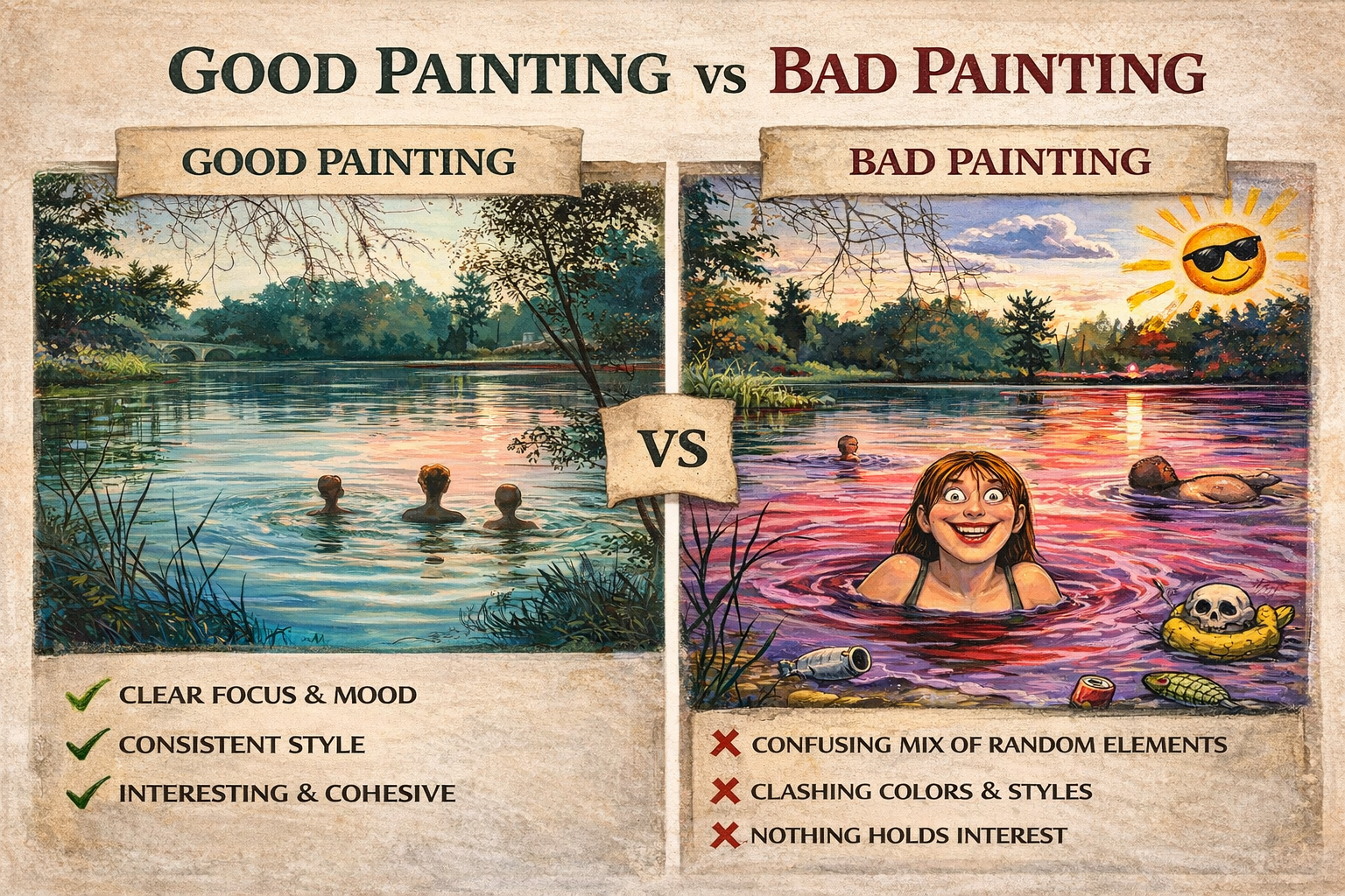
Take a look at these two paintings. Same basic subject — swimmers in a lake, summer, trees, water.
Both were created using AI tools.
One of them works. The other was generated to illustrate every visual mistake an artist can make in a single image.
At first glance, you might just say one looks better. But that's not useful. Let's actually look at why.
A Four-Step Method for Looking at Art
Art educator Edmund Burke Feldman developed a four-step critical framework that's been used in art education for decades — including as a foundational tool in the Alberta Art 10–30 curriculum. It's designed to slow you down and build your response on evidence, not just instinct.
The four steps are: Describe. Analyze. Interpret. Judge.
That order matters. Judgement comes last — after you've actually looked.
Step 1 — Describe: What Do You Actually See?
Set aside opinion entirely. Just inventory what's in front of you.
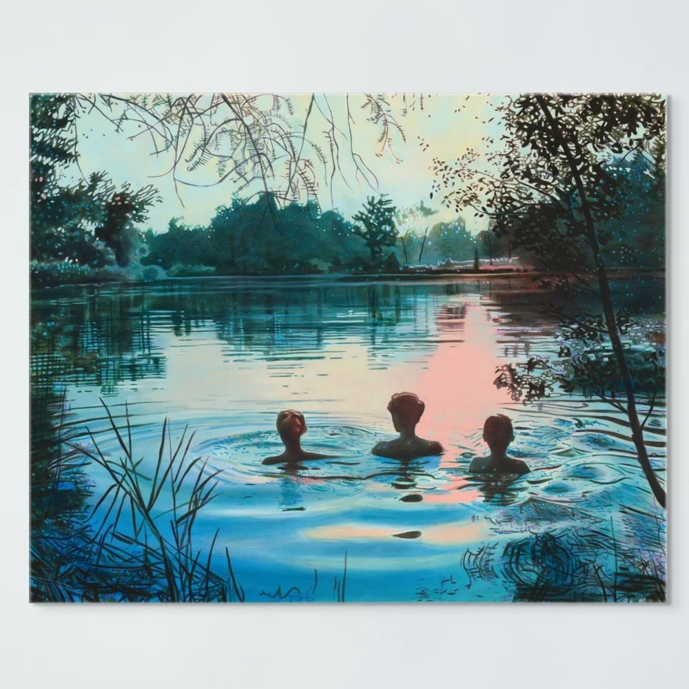
The cohesive painting:
Three figures in the water, seen from behind. Ripples around them. Reeds in the foreground. Trees framing both sides. A pale sky with a warm pink reflection on the water's surface. A stone bridge just visible in the distance. Everything is readable. Everything belongs.
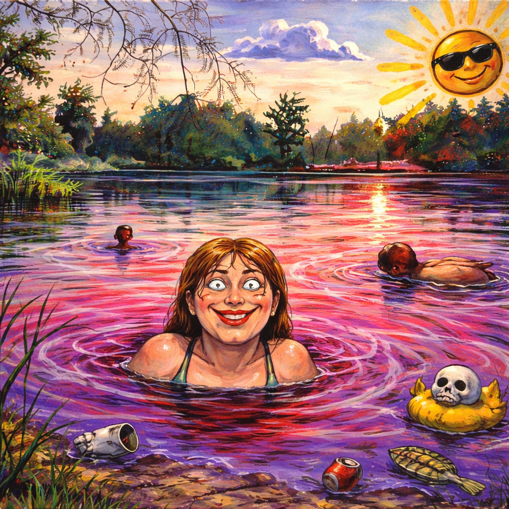
The chaotic version:
A cartoonish woman with wild eyes and an exaggerated grin dominates the foreground. Behind her, two figures float face-down. A skull sits in a rubber duck float. A crushed can and a dead fish float near the shore. A smiley-face sun wearing sunglasses sits in the upper corner. The background is an impressionistic sunset — a completely different style from the cartoon foreground.
You can already feel the difference, even at this stage. One scene invites you in. The other overwhelms you before you've had a chance to settle.
Step 2 — Analyze: How Do the Parts Work Together?
This is where most people skip ahead — and miss the real story.
The cohesive painting:
Your eye enters through the reeds in the lower left, moves naturally to the three figures, then travels up and across the water toward the soft glow of the sky. The cool blues and teals are punctuated by that single warm reflection — pink on the water — which becomes the quiet emotional centre of the piece. Every element supports that moment. Nothing competes with it.
The chaotic version:
There's no clear path for the eye. The cartoon face in the foreground demands immediate attention, but the hyperrealistic background pulls you in a completely different direction. The saturated magenta and violet water clashes with the naturalistic trees. The skull, the fish, the smiley sun — each one is fighting for attention. The styles don't agree. The tones don't agree. The mood doesn't agree.
It's not just messy. It's unsupported. Every element undermines the others.
Step 3 — Interpret: What Does It Feel Like?
This is the step people often jump to first. But without the previous two, your interpretation is just a gut reaction with no foundation. With them, it means something.
The cohesive painting:
There's a quality of memory here. The figures are anonymous — you can't see their faces, so you bring your own. It might remind you of a summer you haven't thought about in years. There's something quietly tender about three people sharing a moment in the water, unposed and unaware. The mood is contemplative. It doesn't ask anything of you. It just holds space.
The chaotic version:
It's trying to be funny — and also eerie — and also environmental commentary with the litter — and also nostalgic with the warm sunset. It doesn't commit to any of it. When meaning is scattered across too many ideas without a unifying intention, nothing lands. You feel the effort. You don't feel the work.
Step 4 — Judge: Does It Stay With You?
This is the step most collectors think they're doing when they buy art. And sometimes they are. But the ones who build collections that stay meaningful over time tend to do this step last — after they've actually looked.
The cohesive painting:
It rewards a second look. And a third. Because the more time you spend with it, the more you notice — the way the ripples interact, the precision in the reeds, the deliberate restraint in the sky. The emotional weight comes from what's left out as much as what's included.
The chaotic version:
It doesn't reward a second look. Everything is immediately visible, immediately loud, and immediately forgettable. There's nowhere to go after the first glance.
A Note on How These Images Were Made
I want to be straightforward about something: the cohesive painting was inspired by a reference image I generated using Midjourney. The chaotic one was made with ChatGPT.
I'm sharing that intentionally.
Because the point of this post isn't to draw a line between human-made and AI-made work. It's to show that visual decisions — intention, cohesion, mood, composition — are what separate a strong image from a weak one. Regardless of the tool.
I made deliberate choices with that image. I directed the mood, the palette, the framing, the restraint. I rejected versions that were too busy, too saturated, too obvious. What remained is the image you see — and it holds together because those decisions were made with purpose.
The chaotic version? Also AI. Same tool, different decisions — or rather, the deliberate absence of good ones. Every bad choice was intentional, to make a point.
That's the argument. The tool doesn't make the work. The judgment does.
What This Means for Collectors
Most people approach buying art by asking: Do I like it?
That's not a bad question. But it's incomplete.
The better question is: Do the choices in this piece support each other?
Does the colour serve the mood? Does the composition lead your eye somewhere intentional? Is there something to come back to?
When the answer is yes across the board — that's when a piece stays with you past the first week it's on your wall.
The Tool Doesn't Explain the Difference
It would be easy to look at these two images and conclude: one was made with good prompting, one with bad prompting — and leave it there.
But that misses the point entirely.
The chaotic painting fails for the same reasons any painting fails: inconsistent style, competing focal points, scattered intention, no unified mood. Those are craft problems. They have nothing to do with the tool and everything to do with the decisions — or lack of them.
This is exactly why Feldman's framework holds up regardless of what technology is in the room. It doesn't ask how something was made. It asks what you see, how it works, what it means, and whether it succeeds.
Those questions don't change. They never have.
Start Here
Next time you're looking at art — in a gallery, online, at a show — try this:
Don't ask if you like it. Ask what you see. Then ask how the parts work together. Then ask what it's doing to you emotionally. Then judge.
You'll be surprised how quickly your eye catches up to your instincts.
FAQ
How do I know if a painting is good? Look at whether the elements support each other — colour, composition, style, and mood should all point in the same direction. Cohesion is one of the most reliable markers of a strong work.
What is the Feldman method of art criticism? It's a four-step framework — Describe, Analyze, Interpret, Judge — developed by Edmund Burke Feldman and used widely in art education, including the Alberta Art 10–30 curriculum. It's designed to delay judgement until after careful observation.
How do I train my eye to look at art? Slow down. Spend more time with fewer pieces. Use a structured approach like Feldman's to move beyond first impressions.
What makes a painting memorable? Restraint, intention, and cohesion. The works that stay with you tend to have a clear emotional centre and enough visual economy that there's always something new to notice.
Can AI-generated art be good? Yes — and I say that as someone who works with AI image tools directly. I used Midjourney to create both images in this post. The cohesive one works because the decisions behind it were intentional. The chaotic one fails because they weren't. The tool is the same. The judgment is what differs. That's the whole point.
Do I need to know art history to collect art confidently? No. A structured way of looking — like Feldman's four steps — gives you a reliable framework that works regardless of your background or experience level.
This post is part of a larger conversation I've been having about AI and art — what it is, what it isn't, and why the debate matters. If you want the bigger picture behind everything covered here, start with the post that started it all. Read: Is AI Art Really Art? What History — and Experience — Tell Us →